Showing posts with label chapter 11. Show all posts

Tuesday, 28 August 2012

Module 5 chapter 11

For my PAP in this module I have decided to make myself the client, for a site specific piece. I have a very nice mood lamp that changes colour to enhance the atmosphere of the room. The only problem is that I don't like the plastic dome in which the lamp is housed.

5/11/1

The place in the room that I propose to put the light will be between 2 windows, with the TV to the left side, so it will be important to diffuse the light when the TV is on.

5/11/2


As it is an LED style lamp it gives out almost no heat and is therefore not going to be a problem re fire hazard if I make a lampshade covering for it.

I decided that I'd like to make a tall floor standing shade so that the light can stand in the bottom and the coloured lights can be seenfrom bottom to top.

I researched a few styles and shapes, seen here.


1 Italian LED Asfour (Swarovski) Tall grand floor lamp

3 Rio Shuko Tall floor lamps

4 Floor lamp Wild Fennel

5 Ibolili Floor lamps with impcact

And then I made a start on skeching some ideas using the embroidery designs that I'd researched at in the last module.

The colour scheme has come from my personal research of the seaside and drawings of shells, and sea holly, as I wanted this piece to remind me of the sea, but it also has to fit in with the decor of the room.


5/11/4

The next challenge was to work out the type of shape shade that I felt would work best plus the kind of decoration it required.

5/11/5
The above sketch shows a spiral design incorporating the embroidery designs mentioned earlier.

5/11/4
5/11/5

The lace spral was made of one piece of FME on nylon organza with a w/s backing which was then cut into strips and has wire couched to it in order to shape the spiral. The base was created with laminated layers of tissue paper that were then FME'd for decoration and strength.

The next idea I tried was a 4 sided shade.

5/11/6

This is still exploring the embroidery designs of the cutwork and the Punto in Aria work.

5/11/7

5/11/8

This trial side has been worked following the front face of the sketch above using a sheet of velum onto wich I transferred the design in pencil and then stitched through it with FME but without thread. I then worked into the holes with silk threads (using the shell inspired colour scheme) in places over the design and I also picked out some areas with a fine drawing pen.

The third prototype design is totally based on the shells in shape and colours.

5/11/8

5/11/9

5/11/10

5/11/11

5/12/13

Some of the shell shapes have been worked on a sheer backgound while others have been worked over a w/s medium whaich was partially dissolved leaving the piece stiff enought to mould to shape.

I'm leaning towards the four sided shade at the moment as my preferred design.

Wednesday, 4 July 2012

Module 4 chapter 11

Resolved sample

The resolved sample for this chapter is to be constructed using a method of felting.

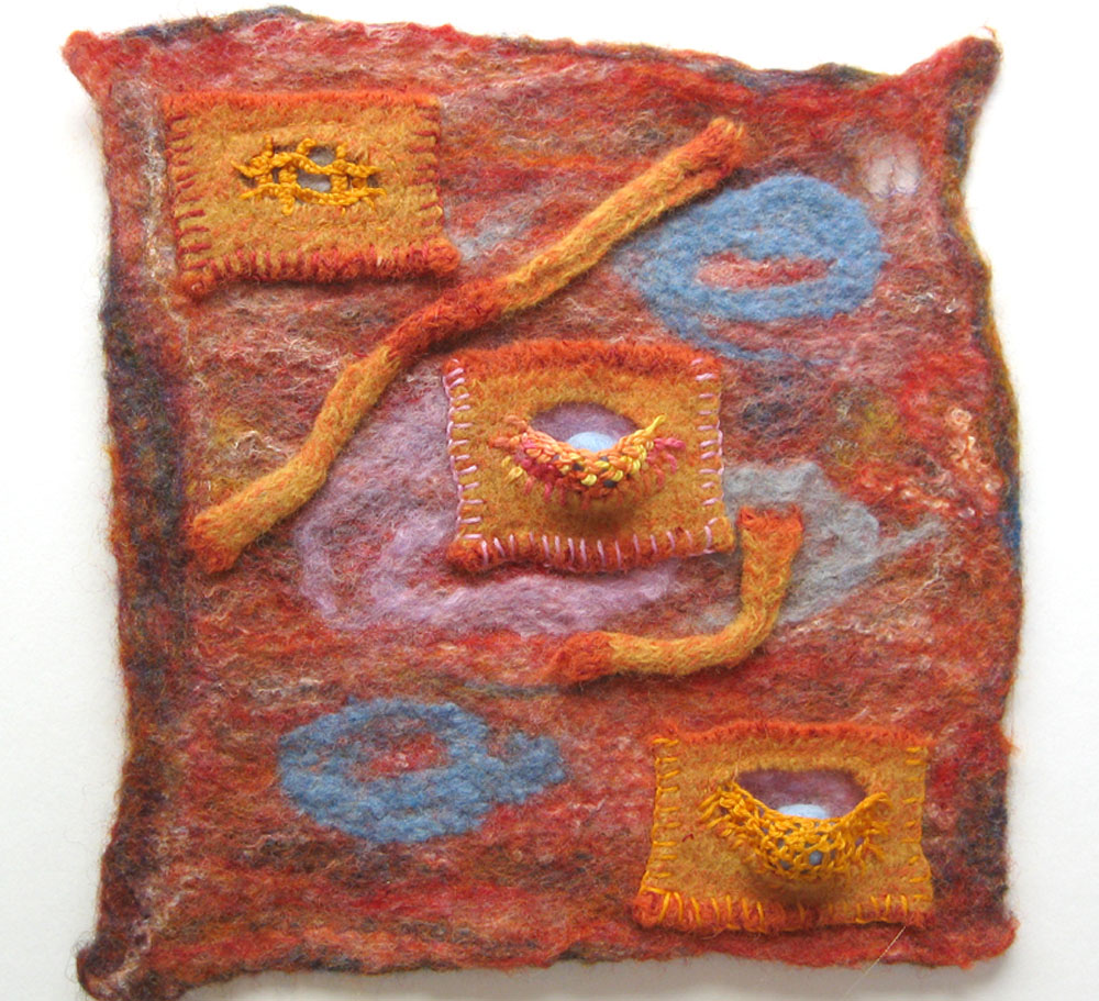
I tried a few ideas for this sample, cutting up the fist sample of chapter 10 into different shapes, some of which were created in chapter 9. I tried applying them to different backgrounds and also tried using some of the samples that I’d worked in the shibori chapter.


4/11/1


4/11/2


4/11/3

I couldn’t find a pleasing direction with the above experiments so I returned to the orange sample and decide to work it up into a resolved sample as I really liked the colour and texture and felt it had potential.


4/11/4


4\11\5

I saw lots of caves in the Tarn Gorges and was very aware of the undulations of the rock faces, which I think gave me the idea of making the pockets with holes and supportive frameworks. This sample also relates to my personal research theme with its shapes of limpets and worms.


4/11/6

The three pocket patches were cut from a felted knitted sample and were stitched to the backing felt with buttonhole stitch.

The middle and bottom patches had a hole cut in them and this was half stitched with Detatched buttonhole stitch and Hollie stitch, respectively.

The curved worm like pieces were then couched to the background.. The piece was then lightly felted.


4/11/7


4/11/8


4/11/9

After felting I decided to fill the 2 Hollie stitched/detached buttonhole pockets with a felted ball each.


4/11/10

The sample was then densely stitched with a Kantha effect, which pulled and shaped it into the undulations and pointed shapes of the natural forms I’d seen on my trip.

I was very pleased with the result and also quite surprised that I returned to a hand stitch technique (Hollie stitch) that I found really difficult to master, but was delighted with it’s effect and versatility..

Monday, 18 July 2011

Module 2 chapter 11

For this chapter we had a choice of working with figures or faces and as I'd been particularly inspired by the figures that I'd studied in the Opus Anglicanum study I decided to use the figure to work from.

Also in the notes was a picture of the Blue Nymph by Alice Kettle which you can see on this great blog i've just found here.
When I looked at the image I thought I'd like to do something similar in Photoshop, the relevance of which will be seen at the end of the chapter.


2/11/1


2/11/2

The starting point for our exploration of using the figure as a design source was to develop some quick sketches of people in an open pose, therefore giving a more interesting pattern to the body shape. I decided to use the RHS figure on the top sketch book pages (2/11/1)


2/11/3

The sketch was then minimised to a simple line drawing where the extremities touch the edge of the paper. The lines were then
cut and the the pieces were placed on a contrasting background with a small gap between all the lines.


2/11/4

Gradually pieces were removed from the design to see what effect this had and also how few pieces it needed to keep the essence of the pose still detectable.


2/11/5


2/11/6


2/11/7


2/11/8

In this last one you can see that all traces of the original pose are just about gone.


2/11/9

The next step was to add a colour and texture element to the basic design, keeping the shapes and movement still within the new designs. I really enjoyed this part and was very surprised to see just how much variety I could generate from such a basic set of lines as a starting point.

As I mentioned earlier my final design exploration was done in Photoshop. I was looking for ways of portraying the fluid lines that Alice Kettle achieved with Blue Nymph.


2/11/10

I started with this picture of an embroidered bookbinding worked by a nun in a convent in Suffolk in the 14th century.

After various filters, morphing and air brushing, all of which has been documented, but would be very time consuming to blog, I came up with this result that I was very happy with.


2/11/11

Wednesday, 4 August 2010

Chapter 11 Last paperwork exercise

This is the last of the paperwork exercises, and one that I'd put off for a while as I was beginning to feel design fatigue, so had skipped ahead to the following stitch chapter. However once I got going, as with most of the other exercises I began to find my way and enjoy it.

The object of the exercise was to make bold, simple marks that would relate to the shapes that have been developing during this module. For the first design I went back to my simple stone shape.


1/11/1

This is worked on a simple blue WC washed BG using felt tip pens and pastel pencil, varying the width of the line.


1/11/2

The BG on this one is spent Procion dye and thick charcoal .


1/11/3

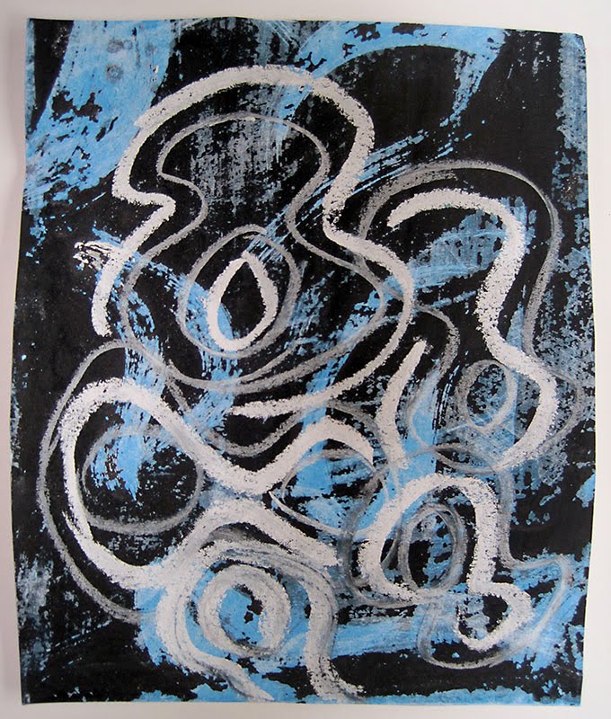
This design was drawn with chalks on a BG made using a 'wash off' technique .


1/11/4

And the last design was created using a base of Quink ink and Kandahar ink over-layed with grey oil pastels. The stone shape was painted thickly with Gesso, which was then enhanced with charcoal and finally sanded with a sanding block.

The first of these designs was then copied and cut up into different sized rectangles and placed together to form patchwork style arrangements in 1 and 2 and repeat patterns in 3 and 4


1/11/5

Design 3 was developed by adding a different textured paper, using a powder paint/sugar/vinegar technique, and then continuing the (stitch) design lines across the whole piece.


1/11/6

The last of the design development is a compilation of several papers that have been incorporated into design 4 and another textured paper using a method called intercutting, which gives qiute a nice patchwork effect. The white lines are representative of stitch lines.


1/11/7

The last part of this exercise was mono printing on a glass/plastic sheet, having first masked some areas with shapes relating to the theme.
In this first one the top has been printed with gentle overall pressure and in the bottom one the masked areas have been pressed with the edge of the fingernail.


1/11/8

In the next one the strips were taken away and as you can see the print is better on the second one where the tape had been pressed down firmly.


1/11/9

The last piece was what was left after I tried to print black Mulberry paper on white acrylic and it disintegrated when I tried to remove it, I rather like the effect.


1/11/10

The next part is the serious stuff of design for my 3d piece, hmmm!!