Showing posts with label chapter 9. Show all posts

Monday, 2 July 2012

Module 4 chapter 9

This chapter is concerned with design using colour, shape and 3D

Colour

In the first exercise I chose 2 complimentary colours, yellow and purple.


4/9/1

The aim was to create a tonal range, by mixing small quantities of each colour until the centre square is a half and half mix.


4/9/2

Looking at the result I was disappointed to see that the resulting range was rather muddy as it got closer to the central square.

This feeling persisted as I made my way through the first set of exercises, I really needed the strong yellow to lift the dark tones of the other colours.


4/9/3


4/9/4


4/9/5

But once I started playing with strips and combinations of shapes on the pre painted BG’s the colour scheme began to come alive a little more.


4/9/6


4/9/7


4/9/8


4/9/9


4/9/10

The next experiment was to add white or black to one or both of the of the original colours and then add thin strips of the piece back in and also thin strips of some of the other colour studies.


4/9/11


4/9/12


4/9/13


4/9/14

Small amounts of colour and self colour added back into these strips seemed much more manageable as a design challenge in this part of the exercise.

Shape


4/9/15

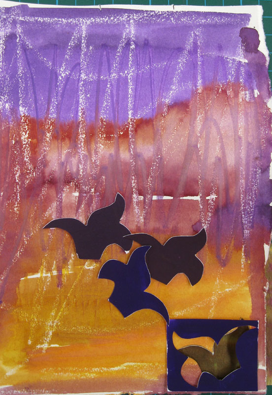
The next part involved making templates of the chosen shape and cutting them out in the pre painted papers, then offering them up on a different BG. This felt much more comfortable and gave some surprising results, when worked with tonal arrangements and colour contrasts.

4/9/16


4/9/17


4/9/18


4/9/19

In the final one of this series I was looking at the shapes left from the cut out template and liked the haphazard arrangement over this piece of paperwork.


4/9/20

Finally I looked at the negative shapes around the templates and coloured these in and then lay the coloured paper shapes back over them.
The fist example is using water soluble crayons which were then washed over with water in places to give a soft edge.


4/9/21


4/9/22


4/9/23

And the last experiment was a watercolour wash as a BG.


4/9/24


4/9/25

This was a very useful exercise and helped me work through what I found to be an unpromising colour scheme to start with, but at the end of the experiments I felt I had something that I could use in future designs, and that linked nicely into the ideas for using slips as an embroidery technique.

The shapes were chosen from this chapter and also a fleur-de-lis pattern from my historical research.

3D

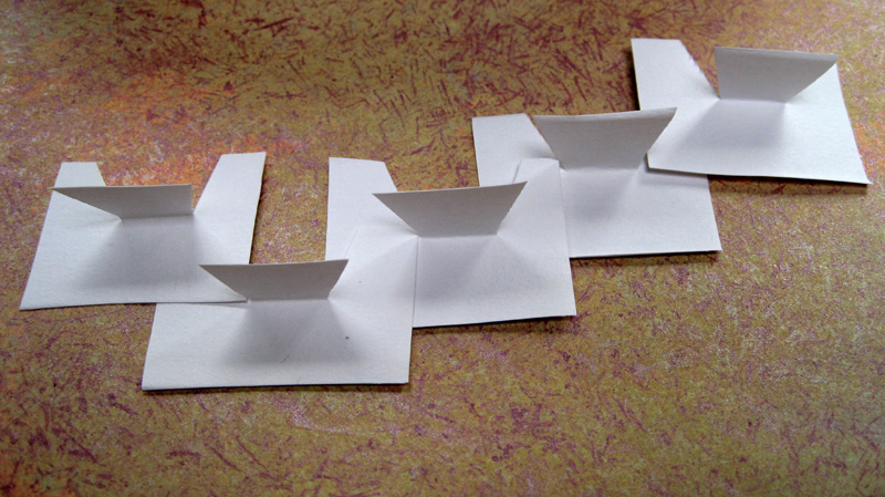
The last part of the chapter is using shapes to create a 3D structure.

The first few exercises are just warming up experiments with simple shapes, rectangles and triangles.


4/9/26


4/9/28

4/9/29

The idea being to create a sequential design.

The next set are created using multiple negative and positive shapes to give 2 different designs, the first being positive.


4/9/30


4/9/31

And the negative


4/9/32


4/9/33

Next I joined 2 layers of pre-painted papers together, cut shapes and manipulated them into designs that would show off both surfaces.


4/9/34


4/9/35


4/9/36


4/9/37


4/9/38


4/9/39

The last design uses both the shapes I’ve been working with.

After an uncertain start with this last part of the chapter, I began to enjoy the process, especially when photographing the results and playing with the shadows.

I can see how it would be an invaluable way of experimenting with 3D design, but as trained flat designer, I did struggle with the process, but was very pleased that I did make some headway by the end and could see the last piece as maybe a piece if jewellery, hat ornament or collar.

Tuesday, 17 May 2011

Module 2 chapter 9


2/9/1

The object of this exercise was to create a different metallic effect by using different coloured threads with metallic threads to see how they changed the effect. It was not something I’d looked forward to doing, as I’ve always had limited success and much frustration with metallic thread breaking and jamming the machine.

However with a new machine, Bernina 630 and good quality thread, it’s favourite being Madeira, I did get some success from the first exercise.

The first (top) sample uses one warm colour with a variety of metallic threads.

The bottom sample is the same exercise keeping the same positions on the grid but this time using a cold coloured thread.

Here the effect that the different colour non metallic thread have on the metallic is now obvious, i.e. alchemy!


2/9/2


2/9/3
The underside of the sample.


The next experiment had less obvious results for me and involved the opposite of the first sample, i.e. one metallic thread and several different ordinary threads in a colour scheme, mine being warm colours. There is a difference in the metallic shades but it’s very subtle.

I learnt a lot from this exercise and made notes on the sample of how to handle metallics in the future, but I would need to do a lot more experimenting with tension etc in order really make use of the possibilities of this technique.


Paperwork techniques, using metallic media.


The next challenge of this chapter was to look at various metallic and pseudo metallic paperwork media that would give a luxurious appearance.

As can be seen in my sketch book pages I worked my way through my supplies, using a range of acrylics, metallic powders, stamp pads, metallic effect wax crayons and various means of applying them, sometimes using plain paper and also using pre colored backgrounds.
I also made use of rubber stamps, lino prints rope printing blocks and lettering.

This was quite a fun process but I found myself longing to get into fabric and start some stitching, which as some of my fellow bloggers will know has always been a stumbling block for me. So I was pretty excited to feel that at long last I could look forward to translating, what has in the past been acres of paperwork, into stitch.


2/9/4


2/9/5

Next up were experiments with metallic foils, hmm! another bète noire. Many hours in the past have been spent with foils in failed attempts to get the results I wanted.


2/9/6

I started experimenting on a fabric as I’m hoping I can incorporate it into a sample later. It’s a hand dyed viscose velvet, bought for devouré, so I had ideas of combining techniques.

The shapes at the top of the sample are a bit crude and solid, but I wanted to see if I could get a solid shape, having only been able to get broken textures like the bottom one.

I tried various glues and they worked well for a broken effect, but Bondaweb was definitely the answer for solid shapes.

The little silver sample of silver leaf on the left was interesting but quite fragile so I don’t know if it would stand up to much stitching. Overall a good revisit to techniques that have been difficult in the past.

Modifying real metal surfaces

The last part of this chapter proved the most difficult for me, and probably the most poignant reminder of my change of circumstances.

As I mentioned we moved house in January, going from a 3 bedroomed house with outside and inside studios to a one bedroomed flat. This of course necessitated downsizing dramatically and therefore binning all of that collected (just in case) stuff that all textile artists amass.

The move had to be completed in 4 weeks so there was no time to plan for future projects such as this, that use some of those, just in case, bits of metal, so I’m afraid this section is lacking. But if I’m totally honest here I was never much of a fan for stitching metal, certainly not on my new Bernina and I now don’t have an old back up machine.

A slight revision to this since writing the post is the loan of a book I already had in my collection, but sent to Oxfam as I was not very impressed with the content, Paper, Metal, and Stitch, Maggie Grey and Jane Wild, hmm, so was this what I was supposed to be aiming for?

So here are the few experiments I have done. The hot chocolate lid has impressed hearts from an old bracelet.

The wine bottle top has been dipped in white spirit and polished with the back of a spoon, but sadly all it produced was a dirty smear.


2/9/7

I was quite pleased with this 2 pence piece that developed this patina after a week soaking in nail varnish remover, it’s still in it so I’ll see how it develops.


2/9/8

This metal wrapper from a scalpel was turning a nice blue also in nail varnish remover, so hopefully that will turn darker after time.


2/9/9

I maybe able to do more experiments over next week as I’m staying with my daughter so will be able to use heat tools without being in danger of setting off the fire alarms for our entire complex.