In this chapter we had to design with outlines of objects and look for a suitable shape, which I now think is the key to this, pick the wrong shape to start with and all is lost :-(
Well I went back through my sketch book and finally came up with a selection:
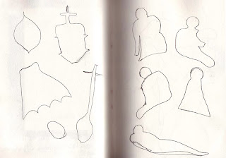
1/7/1
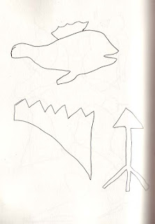
1/7/2
Not very inspiring!!!!!!
Anyway, here's what I chose and the resulting experiments.
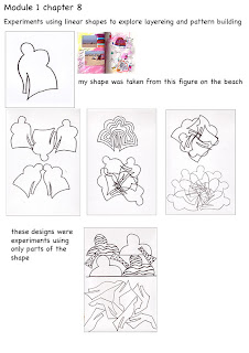
1/7/3
This felt a little better and I was very excited to find the boat house with so much graffiti to play with.
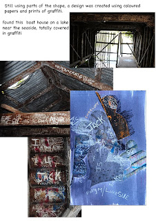
1/7/4
And the final design was beginning to feel a lot more free, so on reflection I think I need to remember that the early experiments are only warming-up exercises.
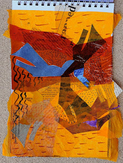
1/7/5
The next exercise was more to my taste, as I felt a bit more confident having settled on a design format for all the pieces.
I used the same motif for the design that I'd developed in the final design in pic 1/7/3 and just turned it various ways until I achieved a satisfying linear pattern that was then machine stitched, without thread, through 6 layers of different papers.
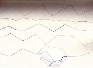
1/7/6
All of these pieces were then put back in different orders on 6 different BG papers using different attachment processes.
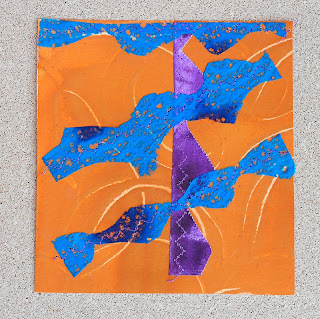
1/7/7
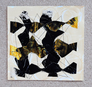
1/7/8
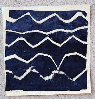
1/7/9
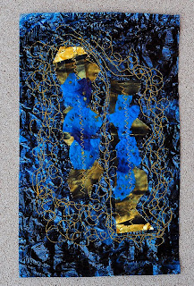
1/7/10
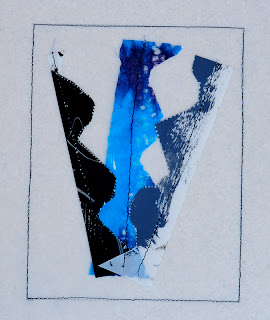
1/7/11
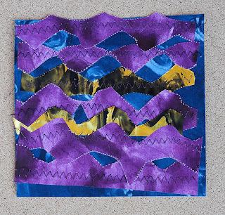
1/7/12
I was quite pleased with this set and enjoyed the challenge of coming up with 6 different designs using the papers I'd made on a previous chapter.
Having been away for 3 weeks and not had time to even look at my coursework, I found it very hard to get my head round the last part of this chapter, which required using a shape within a rectangle, removing and manipulating parts to develop designs.
Once again I realised how important it is to have the right shape to start with, so had several false starts.
Finally I decided to resort to the computer and use Photoshop for inspiration and ease of manipulation.
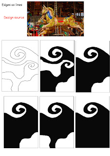
1/7/13
The object of this first part was to see how many pieces you could take away and still have a workable deign, my last one uses only one piece of the original design.
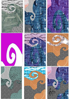
1/7/14
This last composite was all about using colour and texture in a creative way with the design shapes. After a shaky start I did find that I enjoyed parts of the chapter and learnt a great deal about designing with abstract shapes.
I have kept a record of the computer processes used in each of these designs which will be entered in my workbook, hmmm! when I have it up and running.
Yes I found these quite difficult too. I'm still not sure what I did was 'me' but onwards and upwards. Love the graffiti shed and in particular 1/7/7 love the dark colours and they remind me of sweet wrappers!
ReplyDeleteNice work Sharon. It's a good idea to keep track of the steps you use while designing with the computer. I try to do that too, but I often forget and then I can't remember what I did.
ReplyDeleteThe boathouse looks interesting! You have come up with with some great designs to work with; I like the simplicity of 1/7/11 and the sunshine colours of 1/7/5.
ReplyDeleteJane
I love to see the development here. Good to have you back!
ReplyDeleteThese designs are amazing Sharon - I am in awe of what you have achieved!
ReplyDeleteI love seeing other people's creative processes and really enjoyed seeing the progression of your designs. I felt myself sighing along with you as you struggled with the hollow outlines, I am so used to working with tone that I feel somewhat lost without it. I also use photoshop for composition on a frequent basis, it's so good to see someone else doing the same :) Interesting results too, I especially like the one that looks like indigo tie dye. But I imagine you'll be glad to move on to the next chapter :)
ReplyDelete