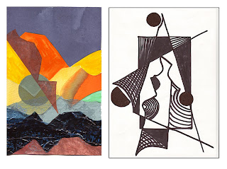
1/10/1
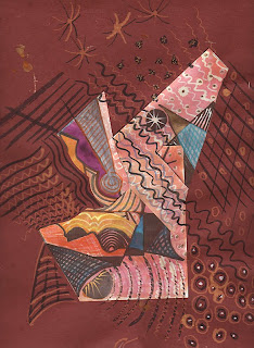
I then washed over several copies with Dr. Martens' diluted inks so you could still see the pattern details beneath. I also put a Photoshop filter on one of the copies.
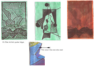
These photocopies were now worked into with various media that would allow the underlying patterns to show through.
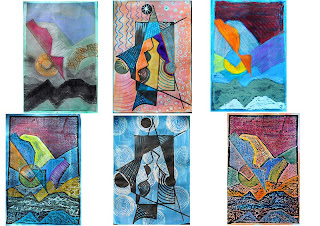
1/10/2
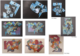
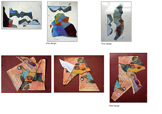
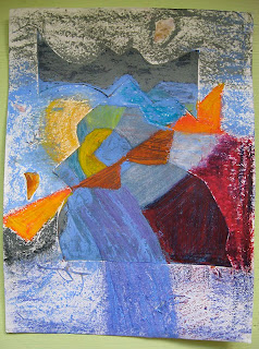
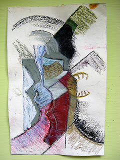
These pieces were now cut across from edge to edge in shapes that echoed the original words that relate to my to my seaside theme Curves, soft, round, textured, fine, rough, movement,rhythm,strength and liquid. The pieces were then re-placed until a pleasing composition was achieved. This was done sometimes using just the pieces from one design and sometimes they were a mixture of the design pieces
1/10/3
1/10/4
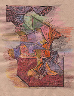
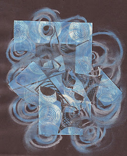
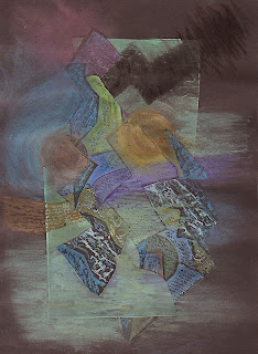
Now each of the final designs were worked back into, extending and enhancing the designs, again trying to get a flow and rhythm that would be reflective of the essence of the theme.
1/10/5
1/10/6
1/10/7
1/10/8
1/10/9
1/10/10
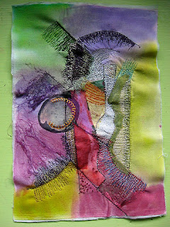
The last part of this exercise was to explore stitch with one or two of the above designs. I chose the last design in the row as it felt exciting and I thought it would be good to work with.
As I'd used a lot of wax pastel I thought it would be a good starting point to iron it onto a cotton BG, but forgot that that would turn the design into a mirror image, but having done it I thought it might still work.
I used lots of textural surfaces that reminded me of the seaside and FME'd marks I'd made on the paperwork.
The result has buckled in a complimentary bumpy fashion, and after I finished it I decided to add colour to the white BG with Koo i noor dyes. On reflection I think it would have worked better on a neutral textured BG.
1/10/11
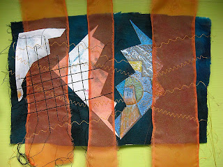
As I felt I'd gone off at a bit of a tangent from the original guidelines I tried another sample with paper and fabric. This would need a lot more developing, and I'm not sure I like it enough to spend any more time on it.
1/10/12
After I started working into the collages, on July 1st I made this record of how I felt I was progressing and as self assessment is part of the C&G criteria I'm recording it here, mainly for the purpose of my tutor and myself, but by all means have a read if it's not too boring.
"At last having a feeling of moving forward and breaking new ground.
For the first time since my return to textiles in 2004 I feel the enthusiasm I felt when I started my Foundation Course in preparation for my degree.
This last chapter - working with abstract shapes has been a journey of sheer panic through to manic surrender, similar to the feeling of jumping off a high diving board, or in my case more likely a scary water slide.
Having jumped in for the first time reason prevailed and I told myself it was only paper and I could repeat the exercise if all went pear shaped.
I have discovered the value of doing things in repetition as it acts as a warm-up exercise, and as a person with a short attention span, this has been a hard lesson to learn, and one that I fought hard against when doing the Certificate..... Always looking to the end of the chapter/exercise to see how many more pages to go.
I'm still doing it!
July 5th (working into the collages)
It's interesting to see that when you've constructed a composition it looks so much more interesting through the camera lens,
maybe it's the frame.
Spent far too long agonising over the perfect composition instead of concentrating on what felt right, and keeping the spontaneity, but some arrangements have felt less easy/obvious to compose.
Great thing about this exercise is you get to use all the different media you've forgotten about and re-find your favourites."
Hi Sharon, but this is an absolutely fabulous blog, I wonder how I didn't come across it before in my web wanderings! You are on my reader list now ...
ReplyDeleteDaniela
Fantastic experiments, I love the angular ones.
ReplyDeleteIt would be interesting to see the difference rotation would make to the purply one.
I love to follow your progress Sharon!!!
ReplyDeleteIt's surprising isn't it how the abstract shapes can reflect the theme - you have some great potential in these designs. Worth the leap!
ReplyDelete