The object of the exercise was to make bold, simple marks that would relate to the shapes that have been developing during this module. For the first design I went back to my simple stone shape.

1/11/1
This is worked on a simple blue WC washed BG using felt tip pens and pastel pencil, varying the width of the line.

1/11/2
The BG on this one is spent Procion dye and thick charcoal .
1/11/3
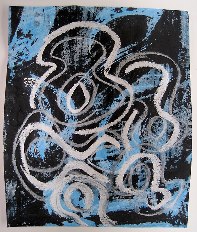
This design was drawn with chalks on a BG made using a 'wash off' technique .

1/11/4
And the last design was created using a base of Quink ink and Kandahar ink over-layed with grey oil pastels. The stone shape was painted thickly with Gesso, which was then enhanced with charcoal and finally sanded with a sanding block.
The first of these designs was then copied and cut up into different sized rectangles and placed together to form patchwork style arrangements in 1 and 2 and repeat patterns in 3 and 4

1/11/5
Design 3 was developed by adding a different textured paper, using a powder paint/sugar/vinegar technique, and then continuing the (stitch) design lines across the whole piece.

1/11/6
The last of the design development is a compilation of several papers that have been incorporated into design 4 and another textured paper using a method called intercutting, which gives qiute a nice patchwork effect. The white lines are representative of stitch lines.

1/11/7
The last part of this exercise was mono printing on a glass/plastic sheet, having first masked some areas with shapes relating to the theme.
In this first one the top has been printed with gentle overall pressure and in the bottom one the masked areas have been pressed with the edge of the fingernail.

1/11/8
In the next one the strips were taken away and as you can see the print is better on the second one where the tape had been pressed down firmly.

1/11/9
The last piece was what was left after I tried to print black Mulberry paper on white acrylic and it disintegrated when I tried to remove it, I rather like the effect.

1/11/10
The next part is the serious stuff of design for my 3d piece, hmmm!!
Lovely stuff Sharon, and the last 'mistake'! They are often the best. Can't wait to see what you are going to do for your 3D piece!
ReplyDeleteThese designs (and the last post) are amazing - I say that mainly because they come from perseverance - I can see your progress and I find it amazing that it 'happens'. I can well understand how you 'enjoy' the process! I do hope you get fabulously good marks for all this work! I envy your ability!
ReplyDeleteIsn't it interesting how these designs are so different from the ones in your last post - you ceratinly have plenty of ideas to use.
ReplyDelete