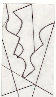
I chose to start with this composition from a design in the previous chapter, as I liked the contrast of the curves and harder lines of the triangles.
1/9/1
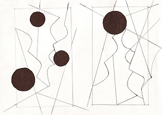
The original curving shape was extended with intersecting straight lines that connected to the edge of a rectangle, as did some of the extended curved lines.
1/9/2
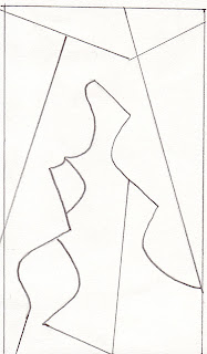
This composition has been developed on a series of words that describe my responses to my chosen theme of the seaside.
Curves, soft, round, textured, fine, rough, movement, rhythm, strength and liquid.
The design was then inverted.
1/9/3
1/8/4
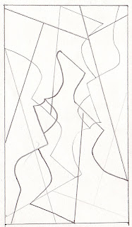
And then traced over randomly several times using different density of line.
1/9/5
These two versions of the design show the addition of circles and extended lines beyond the restraining rectangle.
1/9/6
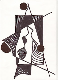
And in the final design, which is my favourite in this series I've explored the idea of filling in some of the shapes with patterns that relate to my theme words and blocks of solid black for contrast.
The next exploration of the design was done on the computer using various Photoshop filters, some singularly and some combined with different effects.

1/9/7
As those of you will know who have followed my creative journey for quite a while, this is one of my favourite media to play with, both for troubleshooting and fun, so I really enjoyed myself on this one. My particular favourite is radial blur and water colour.
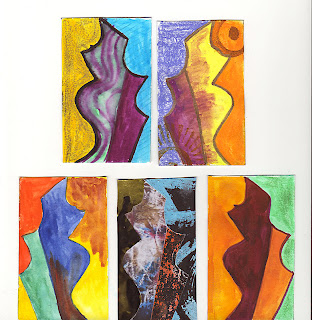
The next step was to add colour and texture to the design. I could have chosen any of my designs, but decided to stick to the basic shape I'd started with.
1/9/8
I used various media for this part of the process including KO-i-Noor dyes, which I love for their vibrancy, Dr. Martens inks, great because they bleach, treasure gold, water soluble crayons, metallic rub-ons and collage,( centre bottom row) which is my favourite.
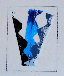
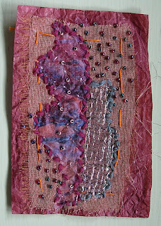
And here are a couple of small stitch samples using the dyed fabrics from earlier in the module. I like the second one better as it has moved away from the original shape and has become more of an inspired piece that directly relates to the words of my theme.
1/9/9
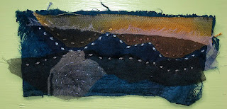
1/8/10
It's such a small piece 5.5"x 2.5", but I'm so pleased with it as it gives me hope that I'm beginning to understand how to approach design more conceptually rather than literally.

1/9/11
The above image shows the next stage of colour exploration, and this time I used a different shape as my starting point (1)
These studies are all looking at different proportions/groupings of colour, as follows:
2. Mainly light toned colours with one dark toned area.
3. Mostly harmonious/analgous colours with one area a complimentary.
4. A combination of two complimentary opposites, using equal proportions.
5. A complimentary opposite using a lot more of one than the other.
6. A reverse of no.5 combination
7. The same/similar colour in a group of connecting shapes to make then look connected.
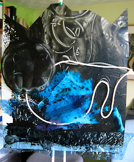
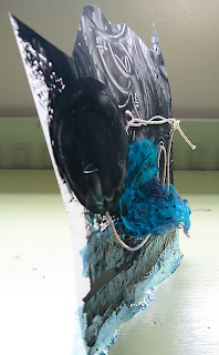
The final challenge in this chapter was to create a textured/manipulated surface that would once again realte to the words of my theme
Curves, soft, round, textured, fine, rough, movement,rhythm,strength and liquid.
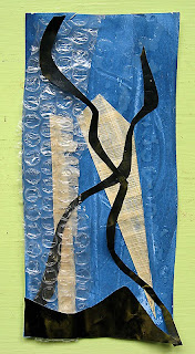
1/9/12
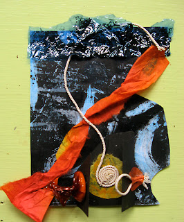
1/9/13
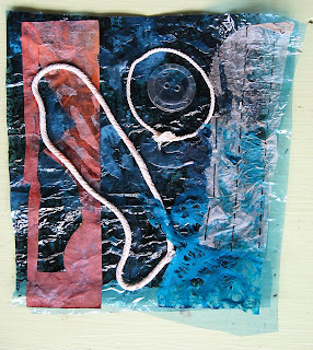
1/9/14
1/9/15
1/9/16
This has been at times an uncomfortable chapter, but I can definitely feel that it's pushing me forward in the direction I've wanted to go for a long time, and although many of the experiments have been not been all together successful, I have felt that freedom and excitement that I experienced when doing my degree foundation year, returning, which is exactly what I was hoping would happen, on this course.
Hi Sharon - great to catch up with what you are doing, and again I am in absolute awe! I don't pretend to like all the pieces (love that little one!) or designs you've achieved, but I can understand where your excitement is coming from, especially if (like me) you find it difficult to 'go abstract'. You have certainly arrived at abstract in this module I must say! Well done all round!
ReplyDeleteI agree with Val, and I like that little piece too, but I really love your 1/9/12 piece.
ReplyDeleteGreat work Sharon.
The master stroke was definitely to turn the design in the first exercise on its side. Up to that point I couldn't really see how the developing design was going to work with your sea theme, then your final piece leapt onto the scene and there was the integration as if it had been waiting there in the background all along.
ReplyDelete