I started with a loose sketch of what I had so far.
PAP 1
I then took this into a couple of sketching apps and arrived at these three ideas.
PAP 3
The idea in 1 came from a couple of sketches from the previous post loosely referencing the trousers and the buoys.
PAP 4
Design 2 is just the original sketch imported into the App and painted and 3 has been worked with the pattern of the angle beads in mind plus some possible ideas of screen printing the BG Sea Holly shape before working layers of stitching to create the helix pattern.
PAP 5
The trial panel was worked on nylon sheer, which was mounted on water-soluble medium and washed out very lightly so it buckled and remained stiff. I took my inspiration from one of the sketches I made of the angle beads in the previous chapter.
PAP 6
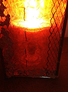
For my first experiment with this panel I had only used the black chain stitch as extra hand stitch so when I put the light inside the frame, I think it was too transparent.
PAP 7
It also looks rather plain when the light isn't on.
PAP 8
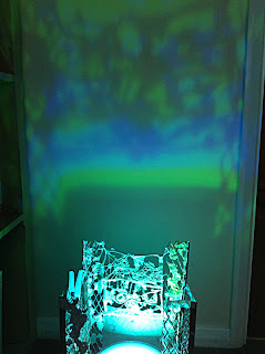
But what I did notice was this beautiful shadow made by the paper pulp sample on the back side.
PAP 9
I then went back to my sketchbook and trialled a few more hand stitch ideas to increase the feeling of rhythm and also make the panel more dense.
PAP 10
You may have noticed that in PAP 8 I have begun to experiment with wrapping the angle beads instead of using paper pulp, I think the effect is more delicate and more rhythmic.
I used wool for the first experiments but have now tried stranded embroidery thread for the shine and colour. The colour pallete has been inspired by the sketches in PAP 6.
PAP 11
I think the added stitching has helped but I will need a backing for this panel as discussed earlier.
During my experiments I tried this knitting sample as a panel and really liked it, but it would have to be stiffened to work.
PAP 12
Lots to think about, not least how to stabilise the frame as I don't want it to have a top and have thought it would a more interesting installation if the uprights were different heights.


I really enjoyed examining your artwork in this post...delicate pencil and paint marks...I also admire your use of the computer as a drawing tool. I have never mastered that process.
ReplyDeletehttp://karenannruane.typepad.com/karen_ruane/
I like the way this is developing.Could you take the basic diamond shape of the corner pieces and develop to make your backing panels,making some large ,some small,some opaque,others transparent.It would continue the rhythm but also hide the lamp and create some contrast.Just a thought.
ReplyDelete