Colour
In the first exercise I chose 2 complimentary colours, yellow and purple.

4/9/1
The aim was to create a tonal range, by mixing small quantities of each colour until the centre square is a half and half mix.

4/9/2
Looking at the result I was disappointed to see that the resulting range was rather muddy as it got closer to the central square.
This feeling persisted as I made my way through the first set of exercises, I really needed the strong yellow to lift the dark tones of the other colours.

4/9/3

4/9/4

4/9/5
But once I started playing with strips and combinations of shapes on the pre painted BG’s the colour scheme began to come alive a little more.

4/9/6

4/9/7

4/9/8

4/9/9

4/9/10
The next experiment was to add white or black to one or both of the of the original colours and then add thin strips of the piece back in and also thin strips of some of the other colour studies.

4/9/11

4/9/12

4/9/13

4/9/14
Small amounts of colour and self colour added back into these strips seemed much more manageable as a design challenge in this part of the exercise.
Shape

4/9/15
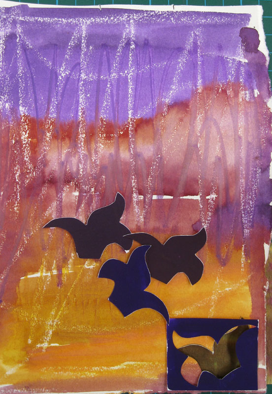
The next part involved making templates of the chosen shape and cutting them out in the pre painted papers, then offering them up on a different BG. This felt much more comfortable and gave some surprising results, when worked with tonal arrangements and colour contrasts.
4/9/16

4/9/17

4/9/18

4/9/19
In the final one of this series I was looking at the shapes left from the cut out template and liked the haphazard arrangement over this piece of paperwork.

4/9/20
Finally I looked at the negative shapes around the templates and coloured these in and then lay the coloured paper shapes back over them.
The fist example is using water soluble crayons which were then washed over with water in places to give a soft edge.

4/9/21

4/9/22

4/9/23
And the last experiment was a watercolour wash as a BG.

4/9/24

4/9/25
This was a very useful exercise and helped me work through what I found to be an unpromising colour scheme to start with, but at the end of the experiments I felt I had something that I could use in future designs, and that linked nicely into the ideas for using slips as an embroidery technique.
The shapes were chosen from this chapter and also a fleur-de-lis pattern from my historical research.
3D
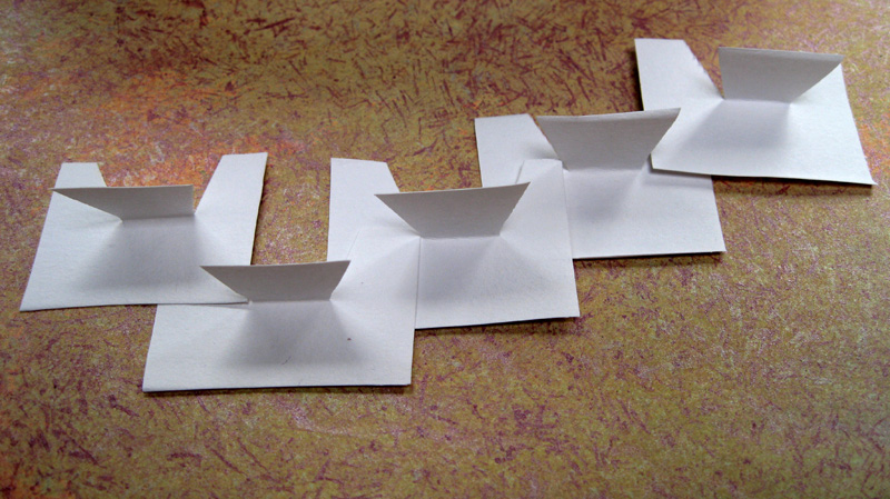
The last part of the chapter is using shapes to create a 3D structure.
The first few exercises are just warming up experiments with simple shapes, rectangles and triangles.

4/9/26

4/9/28
4/9/29
The idea being to create a sequential design.
The next set are created using multiple negative and positive shapes to give 2 different designs, the first being positive.

4/9/30


4/9/31
And the negative

4/9/32

4/9/33
Next I joined 2 layers of pre-painted papers together, cut shapes and manipulated them into designs that would show off both surfaces.

4/9/34

4/9/35

4/9/36

4/9/37

4/9/38

4/9/39
The last design uses both the shapes I’ve been working with.
After an uncertain start with this last part of the chapter, I began to enjoy the process, especially when photographing the results and playing with the shadows.
I can see how it would be an invaluable way of experimenting with 3D design, but as trained flat designer, I did struggle with the process, but was very pleased that I did make some headway by the end and could see the last piece as maybe a piece if jewellery, hat ornament or collar.
What exciting stuff - lovely colour exercises. I've still got all this to come.
ReplyDelete